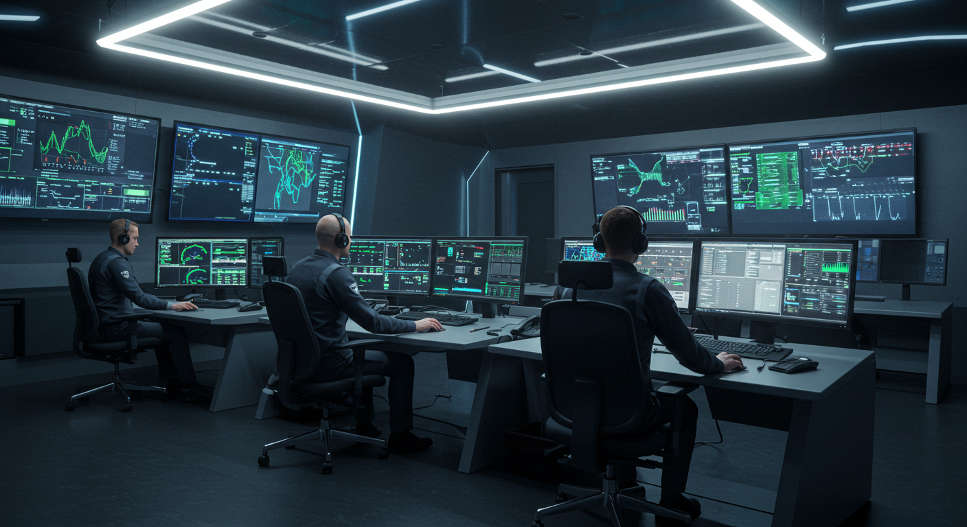
In mission-critical rooms where every second carries weight, the way information is presented visually is not a matter of preference—it is a determinant of performance. The human eye can process an image in 13 milliseconds, but comprehension depends entirely on how that image is structured. This is why the visual language of modern control rooms has evolved into a precise discipline, blending cognitive science, color theory, and interface design to create displays that communicate instantly and unambiguously. Red no longer simply means “danger”; it is calibrated to stand out against background palettes without causing visual fatigue during prolonged exposure. Icons are standardized not for uniformity’s sake, but to reduce cognitive load—so a symbol for “system offline” is recognized in a glance, regardless of the operator’s native language. Data density is carefully balanced: too sparse, and critical trends are missed; too dense, and the signal drowns in noise. The most effective visual systems prioritize hierarchy—guiding the eye from the most urgent alert to supporting context without requiring conscious effort. Even the arrangement of windows on a screen follows ergonomic logic, placing time-sensitive feeds in the central field of vision and reference data in peripheral zones. This orchestration of light, color, and layout transforms raw telemetry into intuitive insight. It ensures that when an anomaly appears—a pressure spike in a pipeline, a sudden drop in network traffic, an unexpected aircraft deviation—the operator doesn’t just see it; they understand it immediately. The goal is not to display more data, but to make the right data impossible to miss. In this silent visual language, clarity is the ultimate luxury, and every pixel serves a purpose: to accelerate awareness, reduce hesitation, and preserve the narrow margin between routine operation and crisis. The room may be quiet, but the screens speak volumes—and in the right visual dialect, their message is understood before a single word is spoken.